If there’s one thing boards like — and need — it’s data. But it can be difficult to strike the right balance. Get it wrong, give them too much or too little, and they might miss an important insight, get stuck in the weeds, or make a poor decision.
To strike that balance, you need to make sure your board pack contains a high-quality KPI (Key Performance Indicators) dashboard. But what does a best practice KPI dashboard look like, and how do you build one?
Read on for our top tips for producing a great company KPI dashboard for your board. Or, if you’re short on time, skip to the bottom to watch our video guide.
What is a KPI dashboard and why do boards need them?
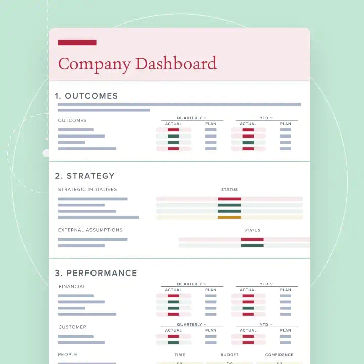
A KPI dashboard provides a visual summary of an organisation’s performance and outlook. It pulls together a range of carefully selected metrics to give directors an “at-a-glance” view of the organisation’s health.
It’s usually one of the first reports a director will read when they open their board pack, sitting alongside the CEO’s report and, ideally, on a single page.
When it’s done well, the KPI dashboard cuts through the noise and helps directors focus their attention, experience, and time on the issues that matter most. It provides a “single source of truth”, ensuring the organisation’s leaders are singing from the same sheet when assessing the business’ health and critical metrics.
Too few directors see this benefit, however, because they’re overwhelmed with information. The average board pack is now 226 pages long — up more than 30% since 2019 — and 54% of directors struggle to find the key messages in them, according to research conducted by Board Intelligence and the Chartered Governance Institute UK & Ireland. A director once told me that reading their board pack felt like “drinking water from a firehose”, because the data was so detailed and dense.
KPI dashboards are one of the most effective ways to address information overload, condensing a potentially limitless supply of datapoints into actionable, board-relevant insights.
How do you build a great KPI dashboard?
Most dashboards tend to focus on short-term financial and operational metrics; 62% of directors think that the management information they’re given is too operational and not strategic enough.
To paint a holistic picture of the organisation’s health, you need to consider a wide range of factors – from finance and operations, to sustainability, stakeholder relationships and customer satisfaction.
But selecting the right metrics, when there are so many to choose from, is easier said than done. How do you build a KPI dashboard that covers all the bases? How do you decide what makes the cut, and what doesn’t?
Here are our top tips for best practice KPI dashboards.
Align your KPIs to your value creation story
Most organisations are drowning in data. It’s easy to end up with 10 pages or more of numbers, graphs, and charts: from what’s required by regulators, to the “just in case” titbits.
We suggest taking a different tack: put your current KPIs to one side and start with your value creation story instead.
This means identifying the main outcomes you’re trying to achieve as an organisation —essentially, the reason it exists — and then thoroughly understanding how you deliver those outcomes to create value. All the metrics you include in your dashboard should stem from, and directly speak to, this handful of high-level goals.
Set the bar high when working out what matters
Framing your dashboard around a core list of high-level outcomes won’t prevent information overload on its own. Each item could bring its own complex set of leading indicators and performance metrics running to many pages.
So, to produce an effective dashboard, think of it as the tip of your organisation’s information pyramid, containing only the highest-level metrics. Remember, the dashboard is not the place to drill into the detail; it’s there to help directors scan the full horizon and work out where to focus.
To do that, keep it to one page.* We believe this can be done even in the largest and most complex organisations. By keeping your dashboard to a single page, you set a high bar for the data that is presented, which helps you avoid “information for information’s sake”. It also fosters greater discipline and focus by forcing management to think critically about what to include and, crucially, what to leave out. The result is a clear, shared understanding of what matters, about what will help the business to meet its goals, and the metrics that show if your plans are working.
Key to this is to frame the data around questions, using questions as headings and presenting the metrics that best, and most directly, answer them. For example, rather than having “financial performance” as a section heading, ask “Did we meet our financial goals?”. Ultimately, data doesn’t drive insight — questions do. Read on for the four key questions we think you need to answer in your KPI dashboard, or you can use the Question Driven Insight (QDI) Principle to work out your own.
*Additional detail, if required, can be covered by functional or business line reports (which can include their own dashboards) or go into an appendix
Check for data blindspots and blurred lines
Once you’ve identified the right questions and metrics, you need to make sure you’re not leaving any dangerous gaps or clouding the picture. That means structuring your data to make sure it covers all the bases, and that nothing is muddled or missing.
Use “mutually exclusive and collectively exhaustive” groupings of metrics to make sure you’re painting the full picture — covering financial and non-financial metrics (such as customer, quality, people), internal and external factors, and provide a forward-looking view as well as looking backwards, and so on.
The dashboard should also cover the high-level themes that help the board deliver its remit:
- Strategy: its progress towards long-term aims
- Performance: results achieved in the last period and how well the forward plan is being delivered
- Governance: the way in which the organisation’s activity is conducted (some measure of retaining your licence to operate — either regulatory or reputational)
We also recommend keeping data and narrative separate. A dashboard is ideally accompanied by a separate narrative (no longer than three pages) explaining where performance excelled or lagged, and its implications. This report is typically written by the chief executive and becomes the scene-setter for the board meeting.
What 4 questions should your company KPI dashboard answer?
Questions are key to deciding what should be on your dashboard. Here are four questions that can help you paint a holistic picture of your organisation’s performance and deliver the insights your directors need.
1. Are we delivering our ambition?
Here, you should provide 2 to 5 metrics that evidence your commercial ambition and your company's higher purpose. Together, these metrics define the reason why you’re in business. Include your principal measure of commercial value, for example, profit or return on capital, then your purpose. What matters to your stakeholders — for example, your customers? How do you measure the impact you promise to them?
2. Is our strategy on track to deliver long-term goals?
This is about strategy execution, which you can demonstrate by reporting on the progress of key programmes and initiatives. And remember: less is more.
Are they on time, on budget, and delivering the benefits that you intended? Then look externally; what could knock your results or strategy off track? These are typically economic market trends and, increasingly, societal and political forces.
3. Are the in-year drivers of performance healthy?
These indicators give you assurance that you’re delivering short-term results. They’re also the levers that management can pull to change the course of your ambition. And they typically straddle product, customer, operations, and innovation; they include your cash position as well as sources of funding to ensure that you can fund that ambition.
4. Are we working in the right way?
You could be smashing your ambition, strategy projects, and short-term KPIs. But does this come at a price? Are corners being cut? Are you harming your long-term reputation?
To help you answer this question, it’s worth thinking about the following two sub-questions:
- What could threaten your license to operate? Regulatory, societal, or climate concerns are examples of drivers that support your license to operate.
- And what does it mean to do business in the right way? Topics such as risk, governance, and culture can be covered here.
Once you’ve pondered these questions, you’ll be able to select metrics that answer them. As you do this, remember two things: consider metrics that have predictive power, and some that are externally reported. This balance ensures that your dashboard won’t be backward-looking or insular.
How can Board Intelligence help you create best practice KPI dashboards?
KPI dashboards are an important tool for boards, but to add value to board discussions and decisions they need to be designed, built, and implemented in the right way.
When there are so many stakeholders and moving parts involved, and you’re busy with your day job, it can be a challenge. So, that’s where we can help: with our dashboard development service, we can do the heavy lifting for you.
We’ll work with you and your board to design and implement a bespoke KPI dashboard that’s built on proven methodology, twenty years’ experience, and industry best practice — and help you turn information overload into actionable insight that unleashes your board’s potential.
And for the narrative that brings your dashboard to life, Report Writer turns your notes and data into a high-quality first draft in a single click — AI built on 20 years of governance expertise, directly within Microsoft Word.
The catalyst of saying ‘what is the data we need to support both our performance and our strategy’ leads to a very robust debate . . . and ultimately you get a much better quality of discussion and decision as a board.”
Charles Gurassa, Chair, Channel 4 — read the case study
With Report Writer, you can go from blank page to ready-to-share paper in a blink, with the help of AI built on 20 years of report writing expertise.
See report writer


